I didn’t want to make these pieces.
But I couldn’t not make them.
As a designer and illustrator, this is how I process the world. I think in symbols. I think in systems. I think in the quiet assumptions baked into everyday visual language and what it means when those assumptions fail.
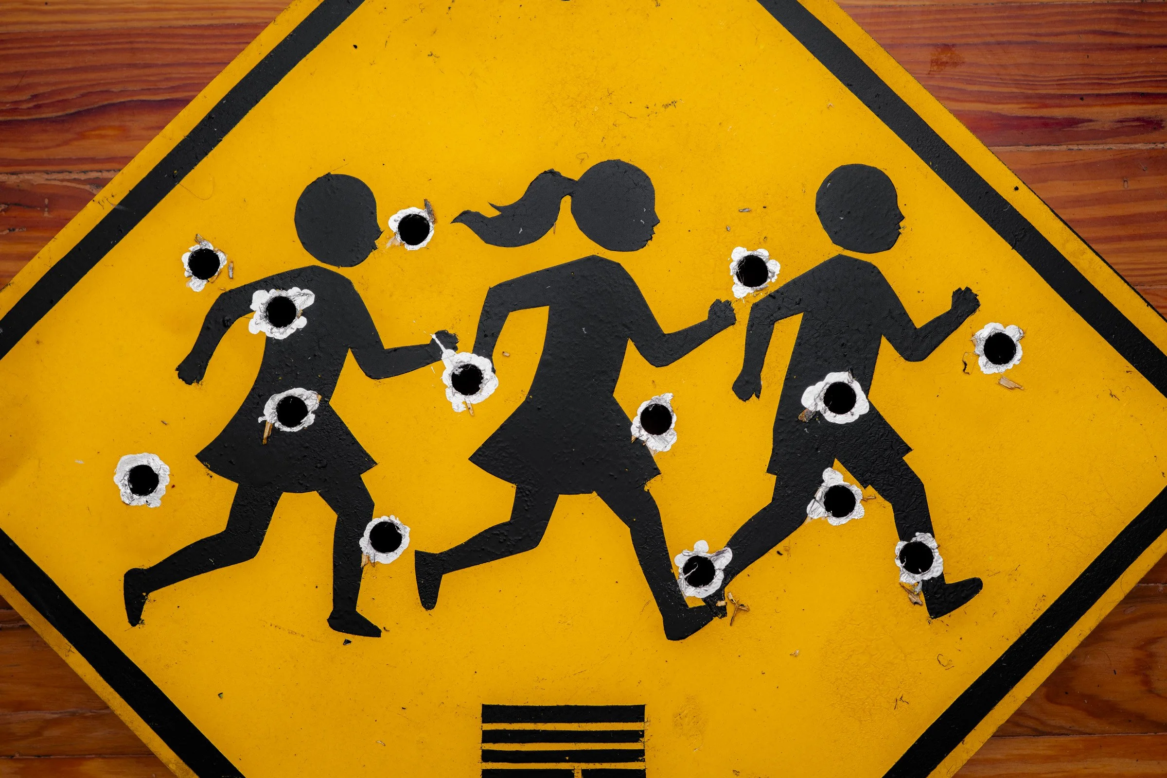
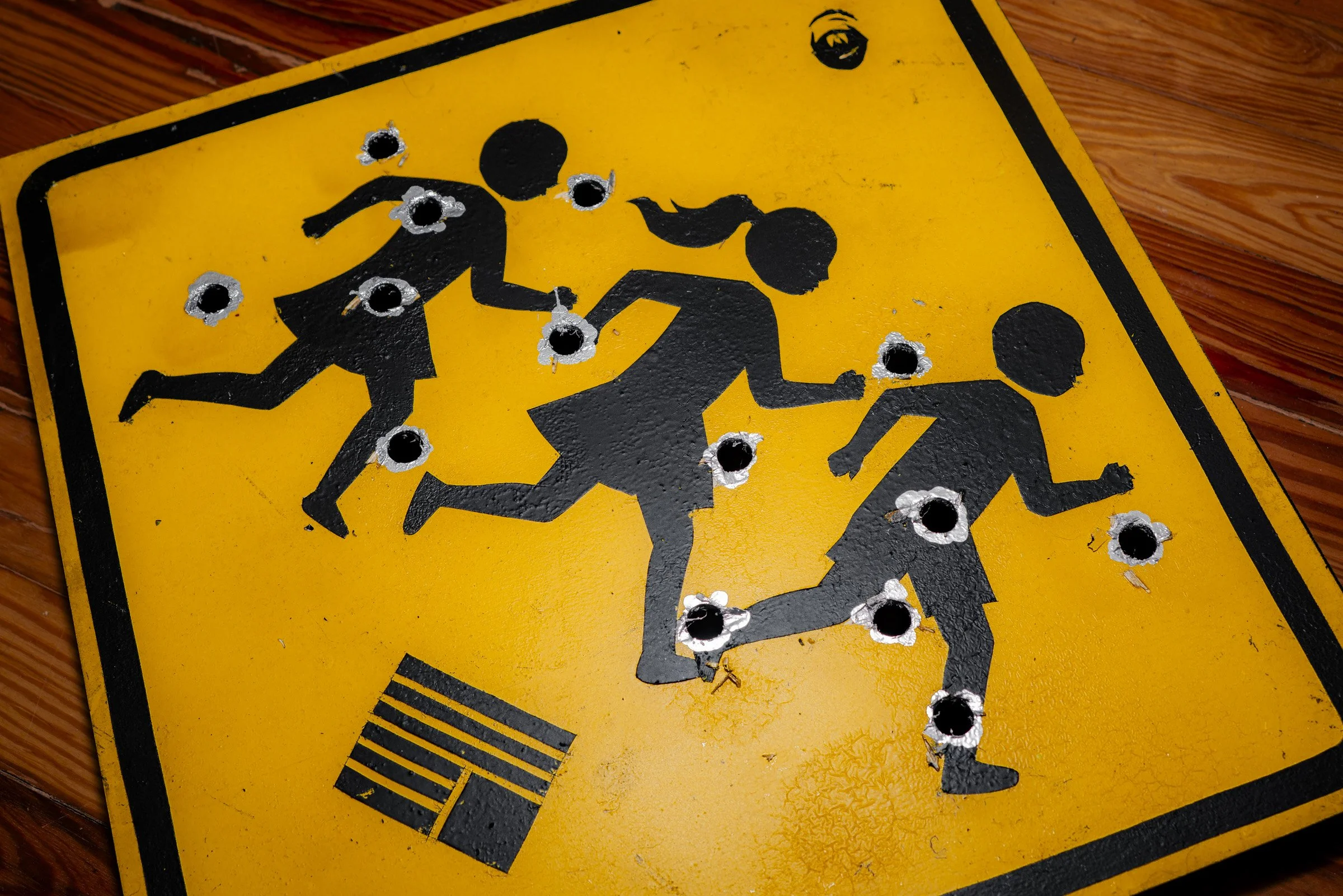
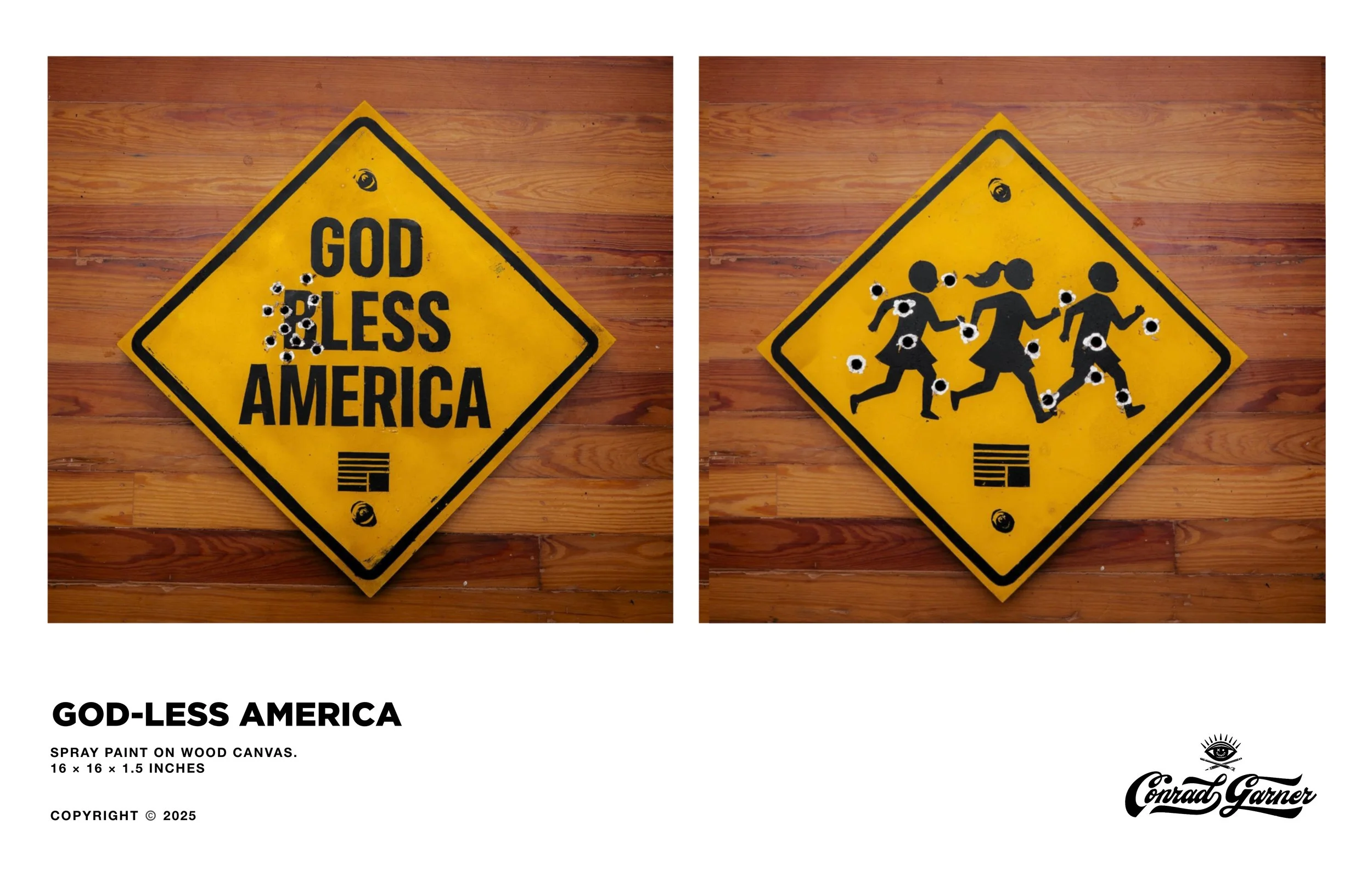
Both of these works use familiar American signage, icons meant to protect, reassure, and warn. They are designed to be universally understood, almost invisible in their normal context. That invisibility is the point. We trust them. We pass them without thinking.
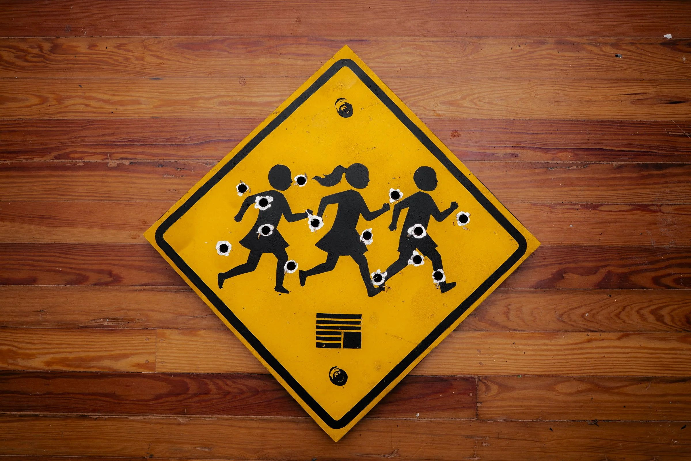
In the first piece, a children crossing sign is riddled with bullet holes. The figures are frozen mid motion, running, vulnerable, urgent. Nothing about the sign has changed except what reality has done to it. The work is about knowing who is at risk, having the ability to intervene, and failing to act.
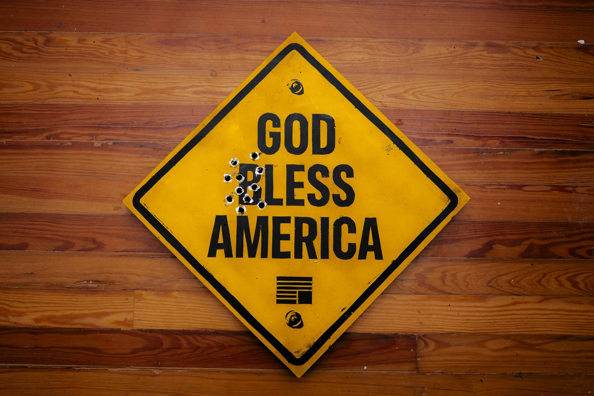
The second piece reads “God Bless America.” Or at least it tries to.
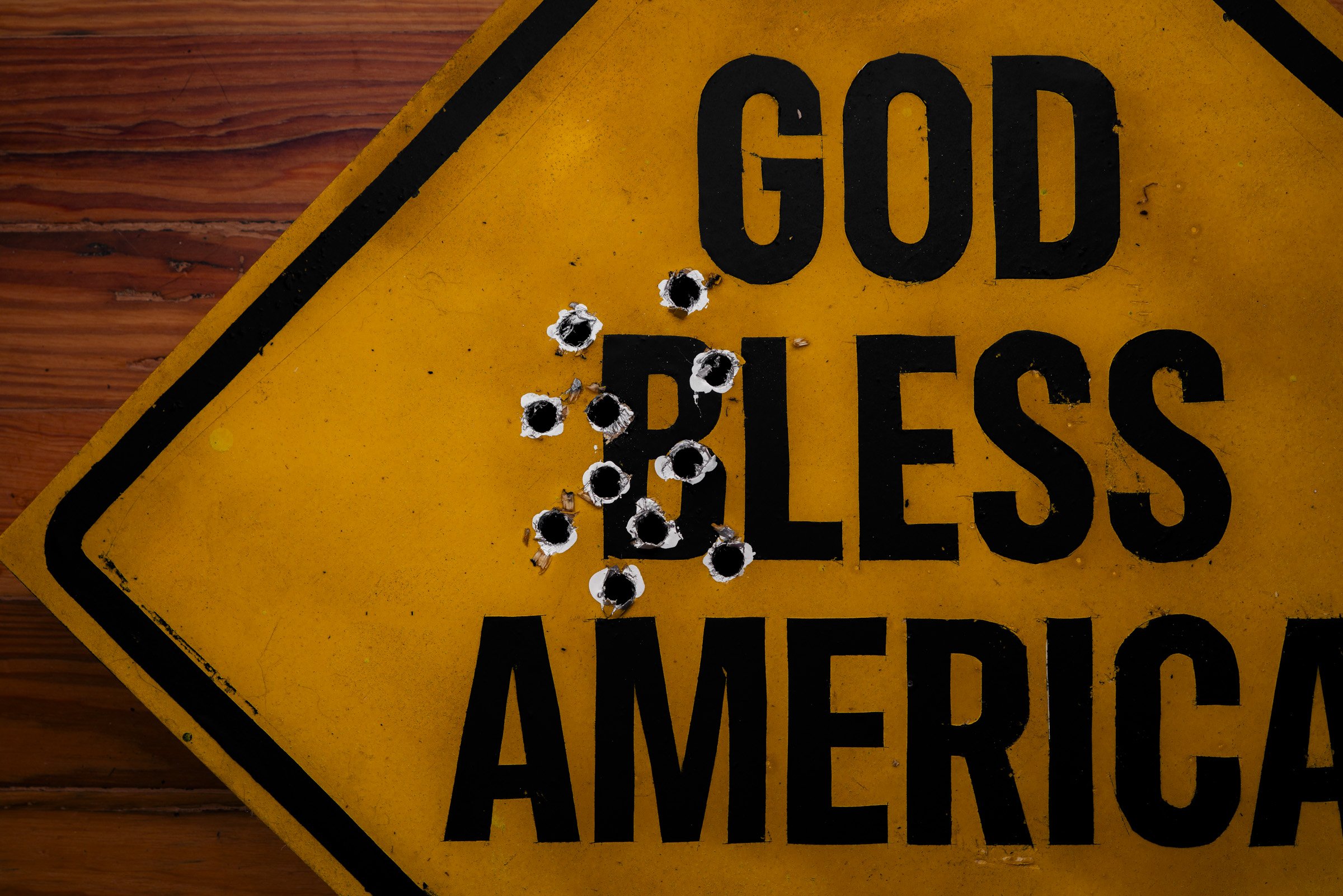
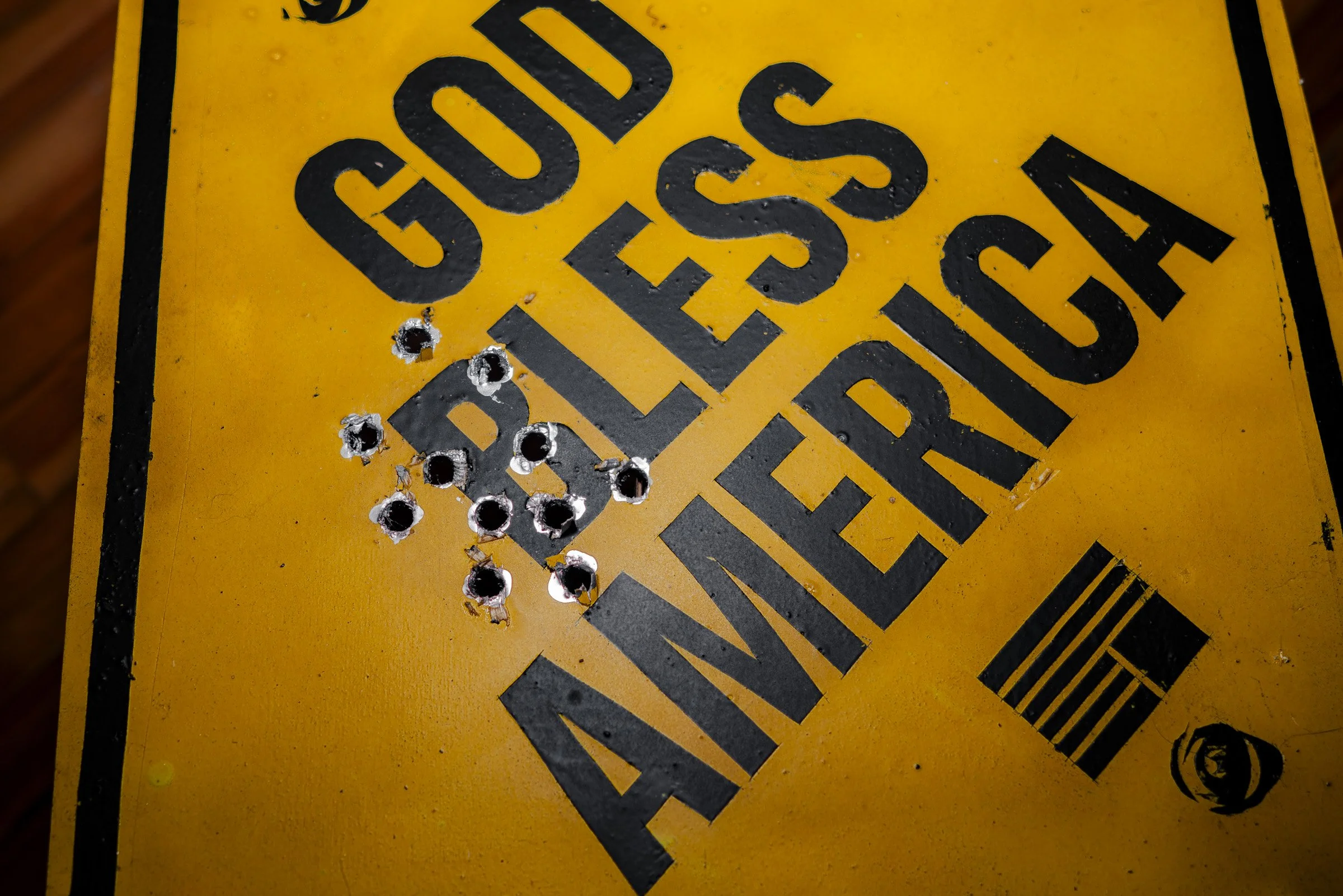
A bullet hole through the B turns Bless into less, leaving behind God less America.
That detail matters. The phrase wasn’t rewritten by design. It was rewritten by damage. Violence edits the message. The typography remains confident and intact, but the meaning collapses under scrutiny. Invocation without responsibility. Faith without protection.
These works are meant to be read together. One shows who we claim to protect. The other shows the language we use when protection fails.
This isn’t satire. It isn’t shock for its own sake. It’s documentation, using the visual language of public safety and civic reassurance to ask a simple question.
What do these symbols mean if they no longer keep people safe?
I don’t like that this work needed to exist.
But pretending everything is fine felt worse.
Sometimes the most honest thing a designer can do is let the system speak, then show where it breaks.