Project Overview
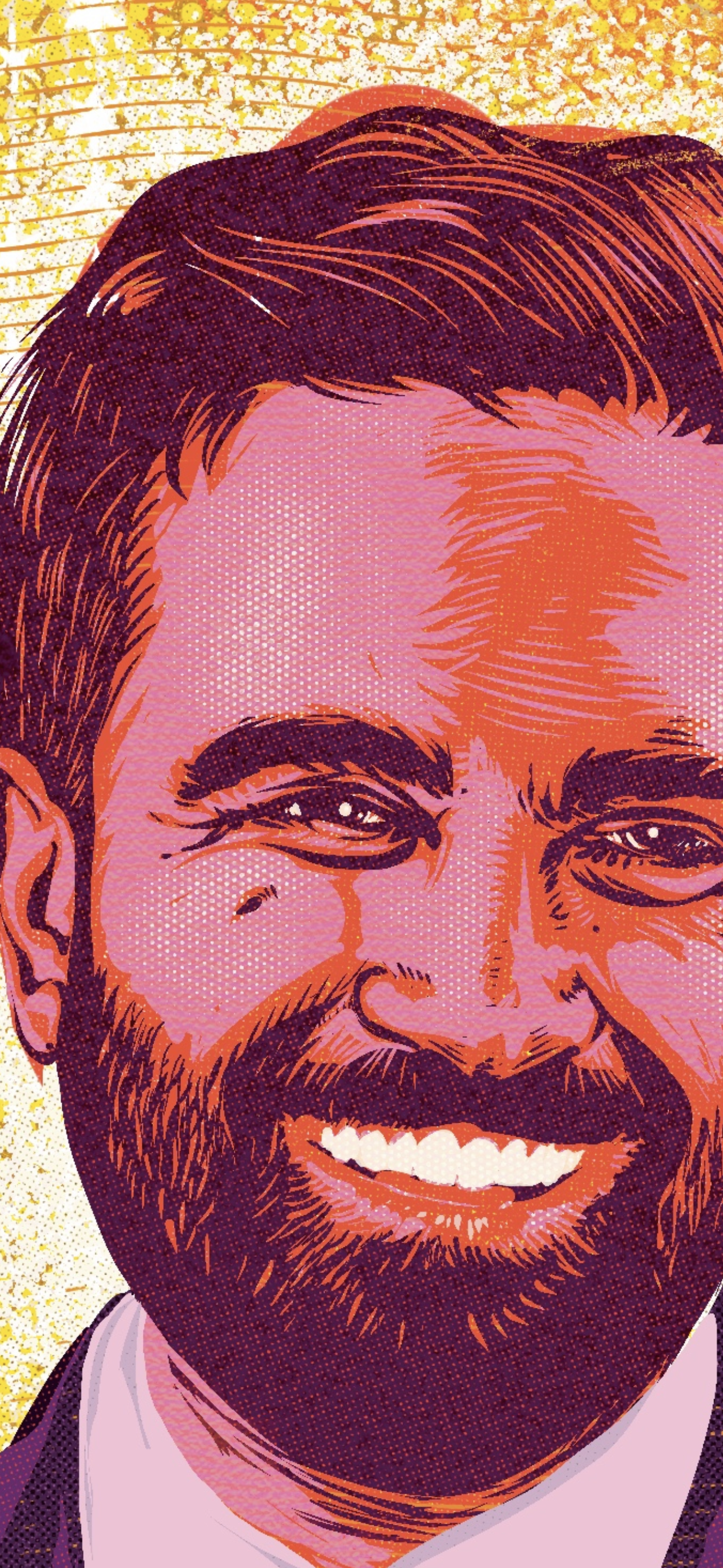
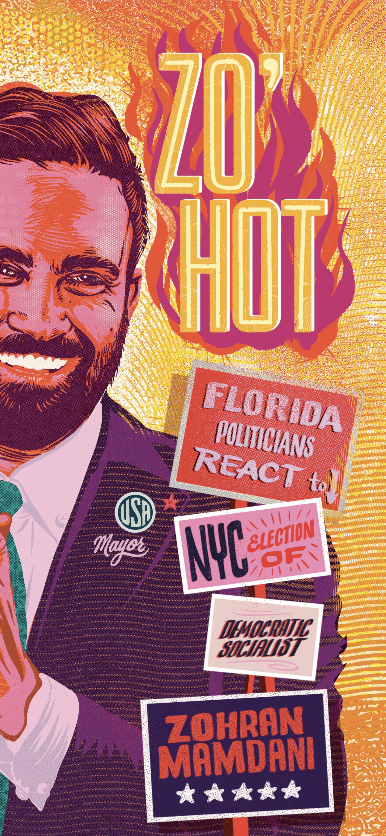
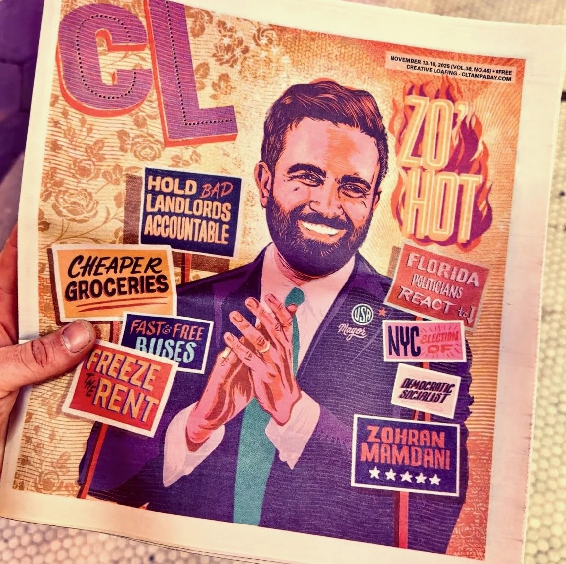
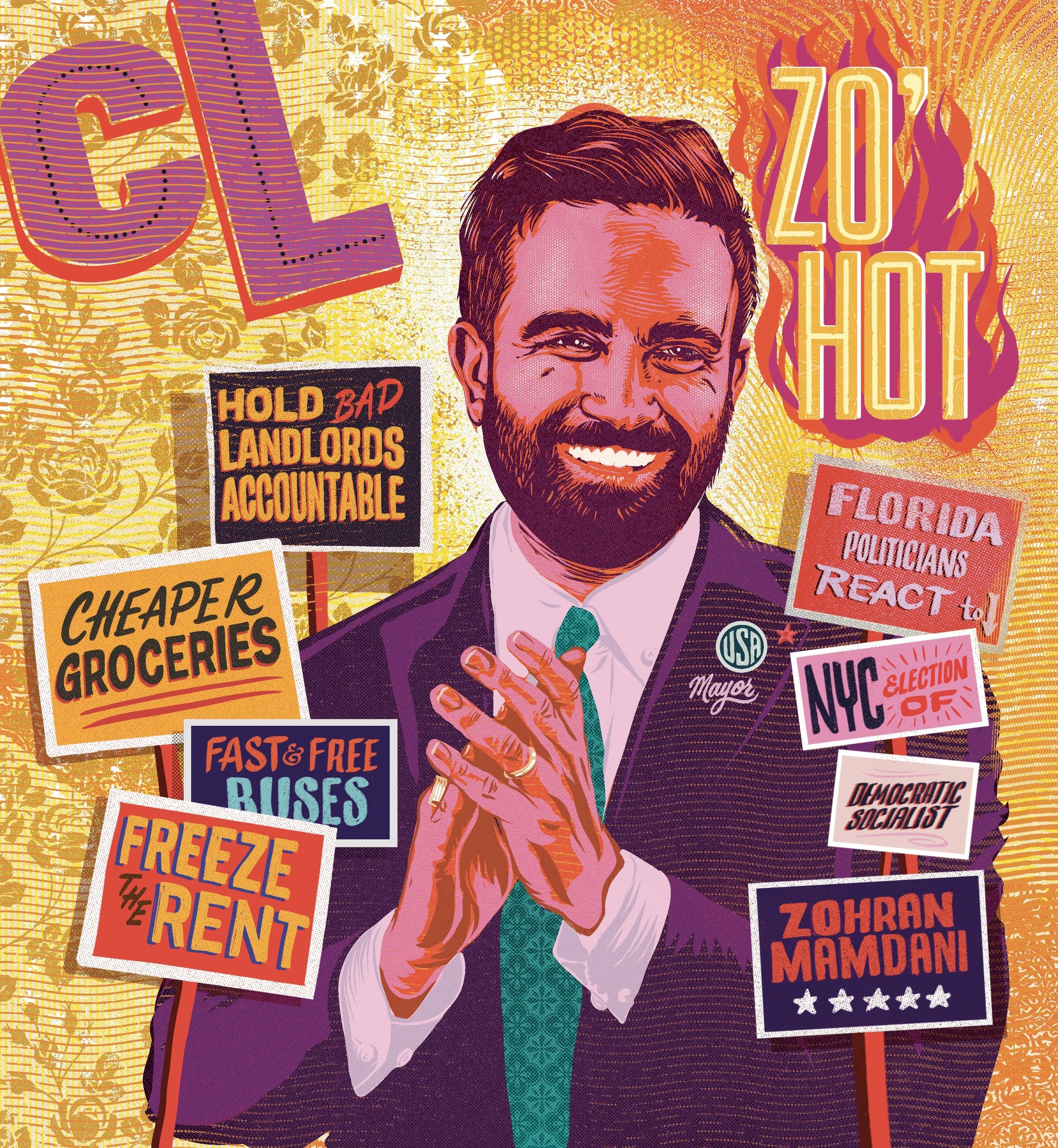
This editorial illustration was created for Creative Loafing Tampa as a political campaign style cover featuring Zohran Mamdani. The piece combines bold character illustration, hand lettered typography, and layered visual messaging to reflect the urgency, tension, and spectacle of contemporary local politics.
The goal was to create an image that felt loud, confident, and unmistakably editorial. The poster needed to work equally well on a newsstand, online, or as a standalone piece of political art.
Client
Creative Loafing Tampa
Editorial and News Media
My Role
Concept development
Editorial illustration
Character rendering
Typography and hand lettering
Color palette and texture design
Print ready final artwork
Creative Brief and Objective
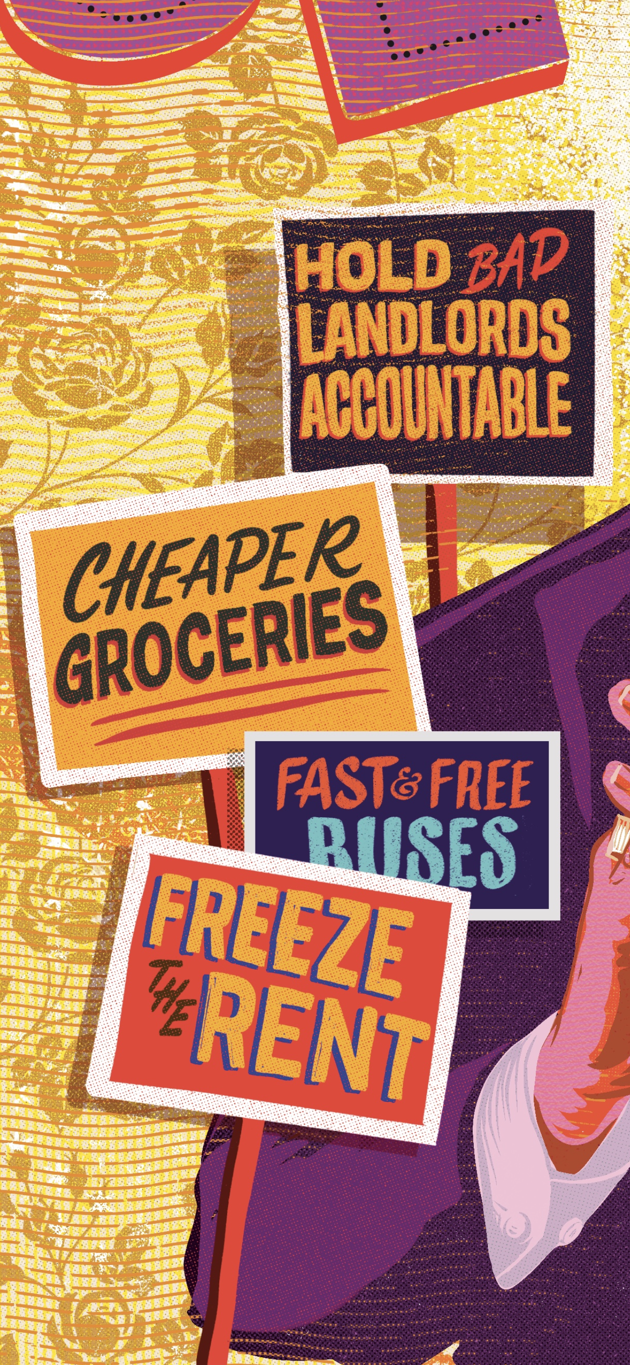
The illustration needed to communicate multiple political ideas at once while remaining visually cohesive and immediately readable. Inspired by campaign posters, protest signage, and vintage print ephemera, the composition was designed to feel energetic and dense, layered with messages, symbols, and visual texture without becoming chaotic.
The central challenge was balance. The image needed a strong, iconic portrait while allowing surrounding typography and signage to function as narrative elements rather than background noise.
Visual Style and Art Direction
The final style leans heavily into bold linework, simplified forms, and high contrast color. The portrait was rendered with thick, confident strokes to maintain clarity at scale, while halftone textures and grain introduce warmth and a tactile, print driven feel.
Typography plays a critical role in the composition. Each sign functions as both design and messaging, borrowing from protest placards, campaign graphics, and editorial headline aesthetics. Color choices skew warm and saturated, reinforcing the intensity suggested by the subject matter.
Key visual influences include political poster art, screen printing, risograph textures, and classic editorial illustration.
Process
The project began with loose concept sketches focused on pose, expression, and overall composition. Once the portrait direction was established, attention shifted to typography and sign placement, ensuring each message felt intentional and readable within the larger layout.
The illustration was executed using my custom Procreate brush set, developed specifically for bold linework, organic texture, and print style halftone effects. These brushes are the same tools I use across my editorial and commercial illustration work and are available on my site at
https://www.conradgarner.com/brushes
From there, the artwork was refined through multiple passes of color, texture, and halftone treatment to achieve a cohesive, print ready look. Special attention was paid to line weight consistency and texture density so the final piece would reproduce cleanly in both print and digital formats.
Brush Preview
All linework, shading, and texture in this illustration were created using my custom Procreate brushes. The set includes brushes designed for bold contour lines, dry ink texture, halftone shading, and organic grain inspired by screen print and risograph processes.
These brushes are built to support simplified, iconic illustration styles while maintaining enough texture to feel tactile and print focused. They are the same tools I rely on for editorial illustration, poster art, and commercial projects.
Brush previews and downloads are available here
https://www.conradgarner.com/brushes
Final Deliverables
Editorial cover illustration
Print ready poster artwork
Web optimized digital assets
Tools Used
Procreate using custom Conrad Garner brushes
Adobe Photoshop
Adobe Illustrator
Results and Usage
The illustration was published as an editorial cover and used across digital platforms to support political coverage. Designed with versatility in mind, the artwork functions as both a news driven illustration and a standalone visual statement.
Takeaway
This project reflects my approach to editorial illustration. Bold composition, strong character work, and typography that carries narrative weight are central to my process. I aim to create images that feel immediate, expressive, and rooted in real cultural moments, illustrations that amplify the story rather than simply accompany it.